Starbucks
Sign illustrator (2014 Jan—2016 Nov)
At Malmö
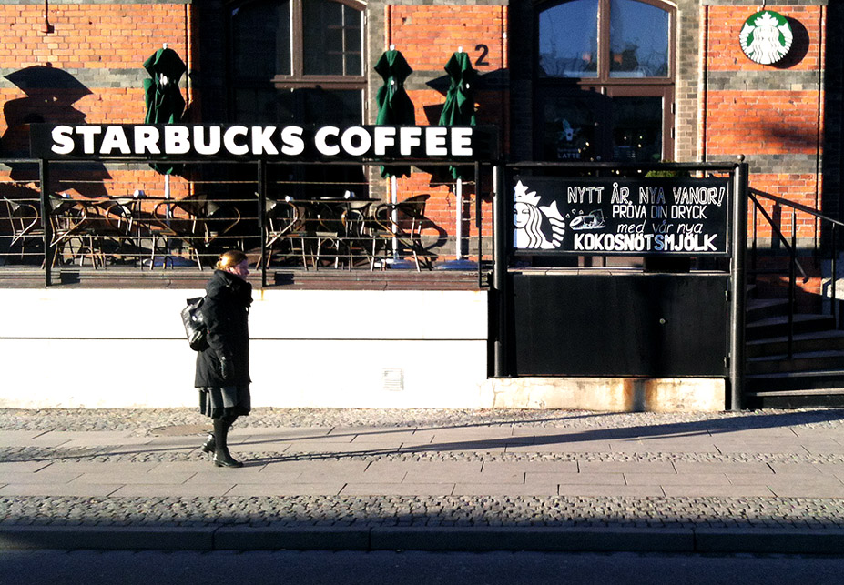
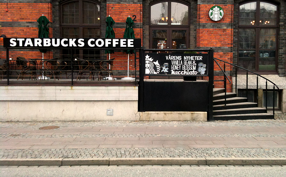
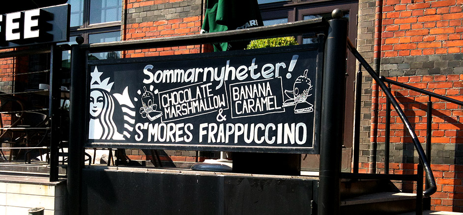
Designed and made signage work towards promotional campaigns for the outside café board. 18 boards were designed and painted.
Promotional campaigns
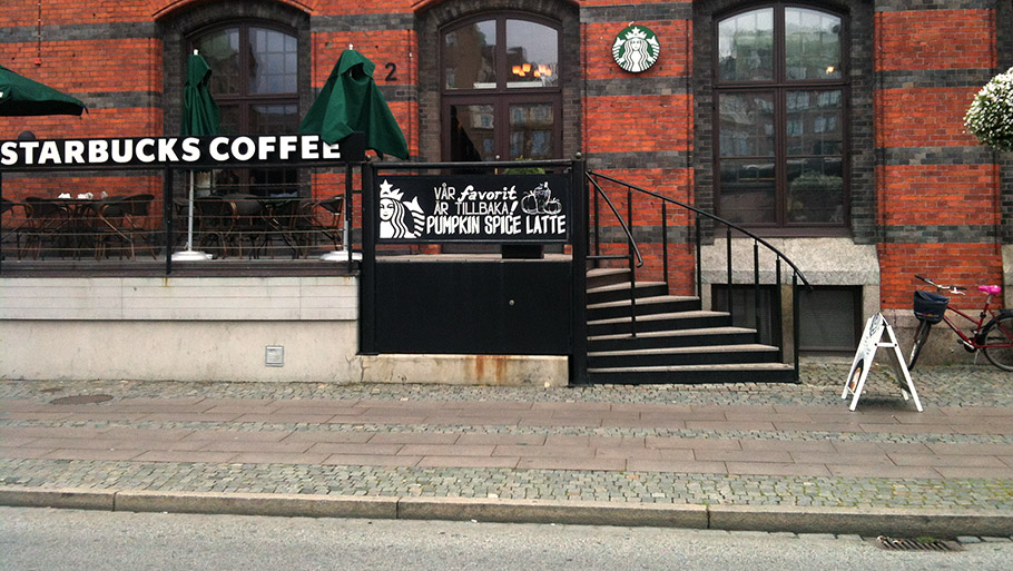
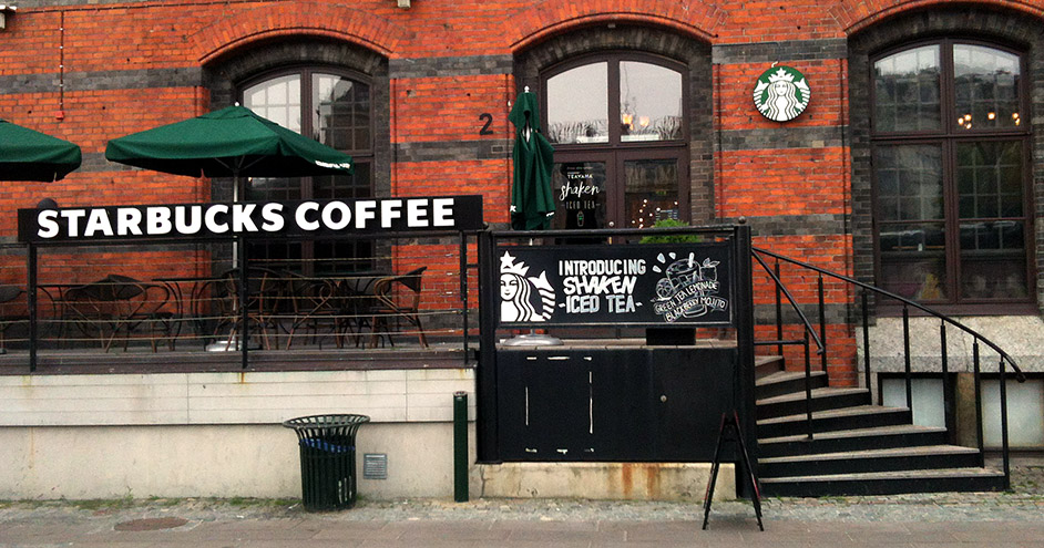
At first it started out as a favor for the baristas at Starbucks. They noticed quite early on that we were regularly visiting the café to do sketch jams with friends, and a super friendly relationship naturally came about from being (at that point in time) weekly patrons.
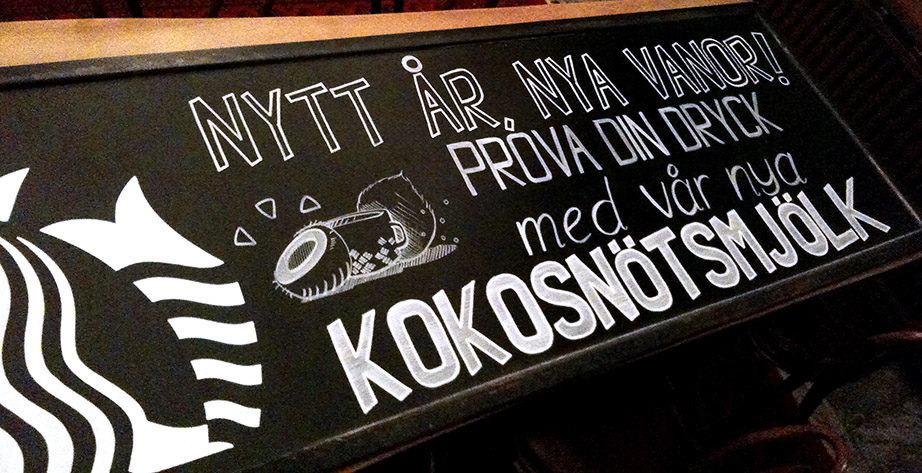
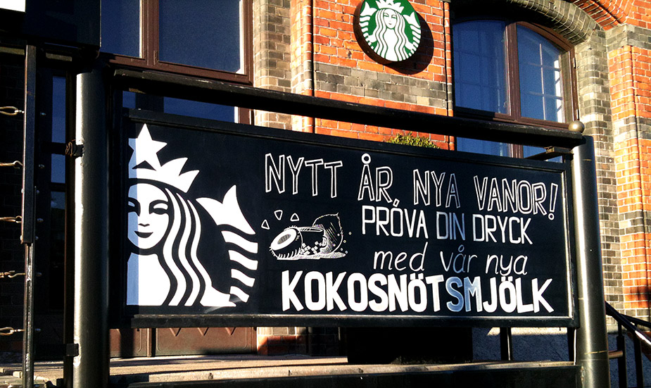
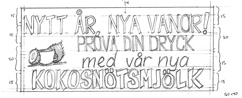
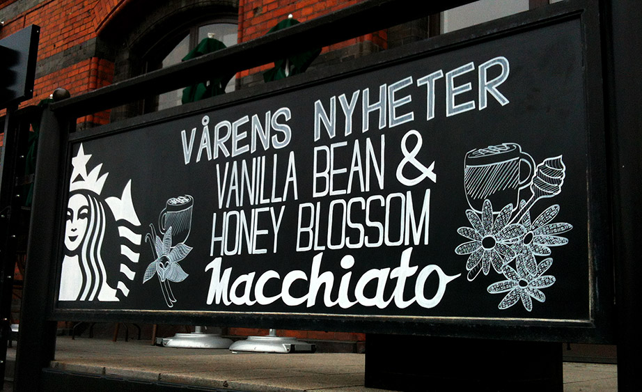
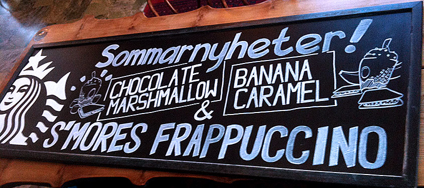
Note that I am missing photos for the 2014 September campaign as I did not do that board (so that's omitted from here). During the time I illustrated these boards I did get help to fill and paint the work in from friends. It would have been hard to finish the sign within a single working day for just about all these boards otherwise. Each sign takes between 3-6 hours to complete on average.
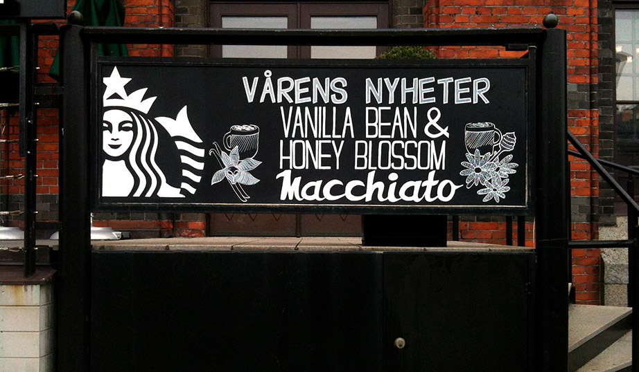
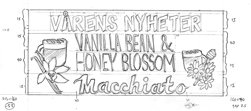
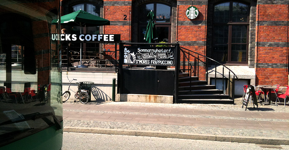
Collection of signage work
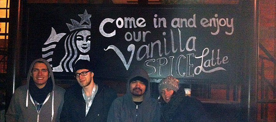 2014 February campaign: This was the first board I helped make. We did the design and painting of the board outside and in the cold. I think we somehow did this without a proper drawing made beforehand.
 2014 March campaign: At first the brief said it should be in Swedish, but later changed it to English. As it was still one of the first signs made there was some slight alignment issues. Turned out nicely though.
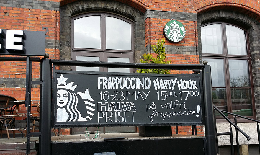
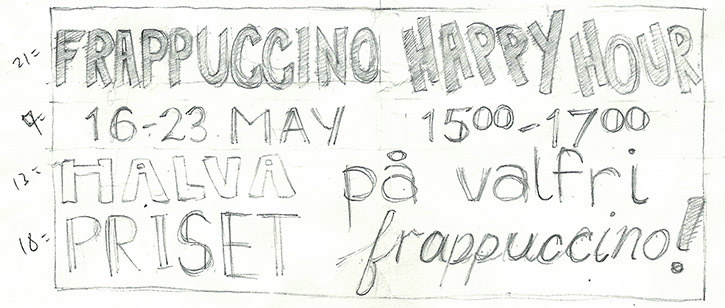 2014 May campaign: Started adding more structure to the use of type. Was partly still playing around with how it could look.
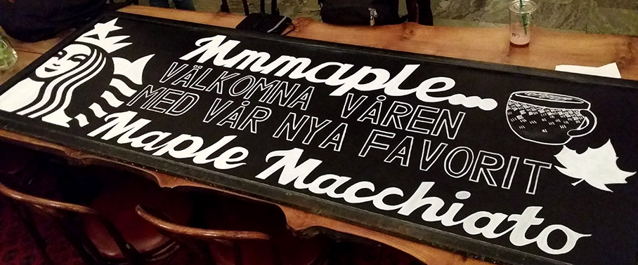
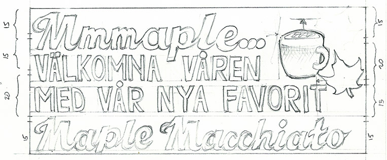
 2014 July campaign: This sign had a much stronger design, and I was able to work in a new personal type.
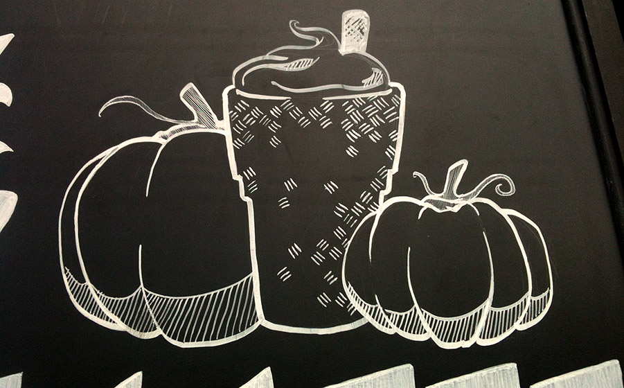
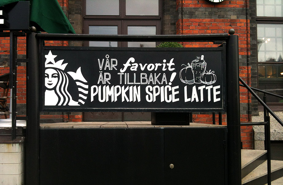
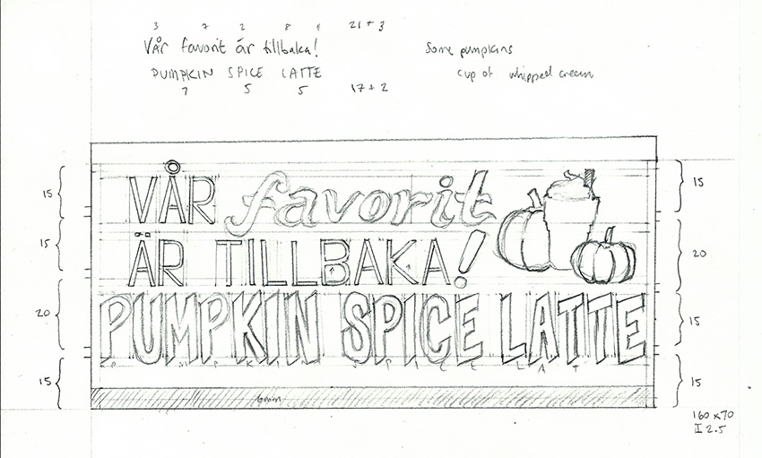
 2014 November campaign: This campaign was pretty straightforward. It felt good to have a lot less text (and to sneak in the flavor on the cup instead).
 2015 January campaign: Probably the first time we started being able to work on the board indoors instead of having a ladder outside. This had some extra space for a different ad on the same board.
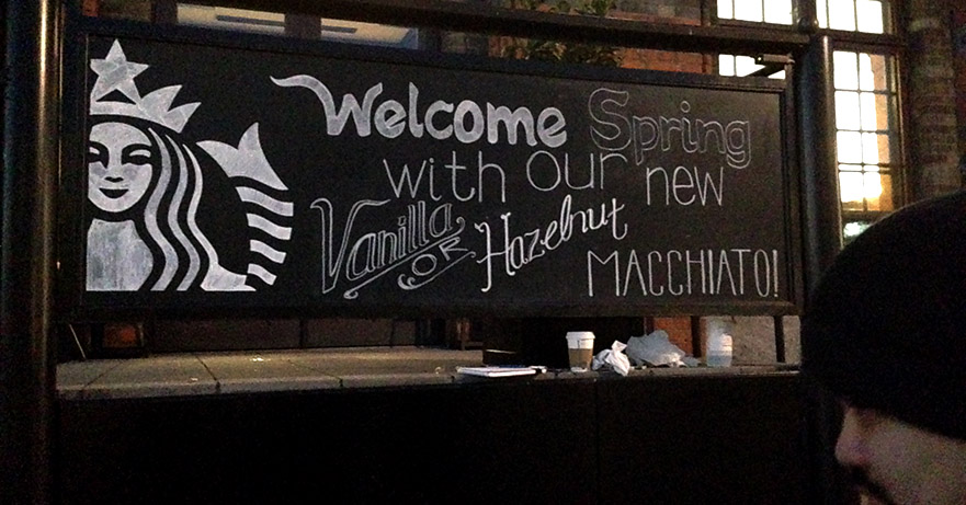
 2015 March campaign: This one used an OFL font for the cursive styled type. It was fun to contrast the type with a type that had a thinner outline.
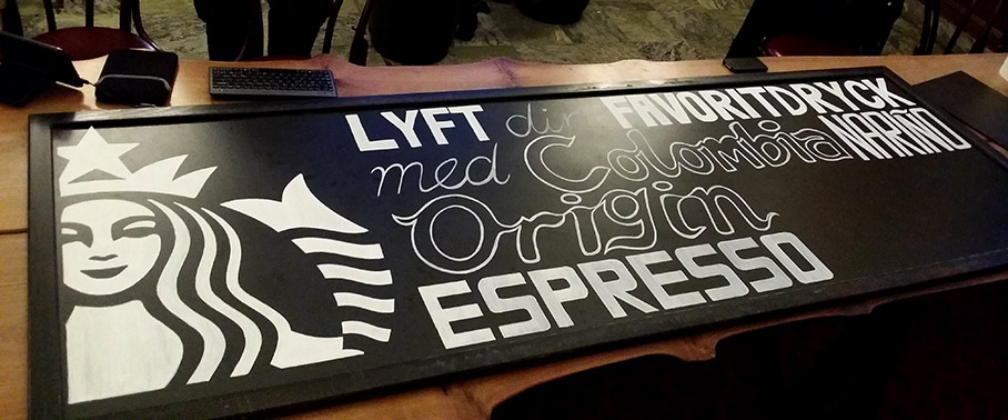
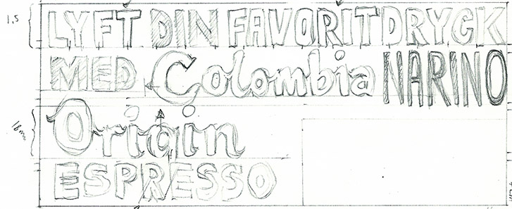
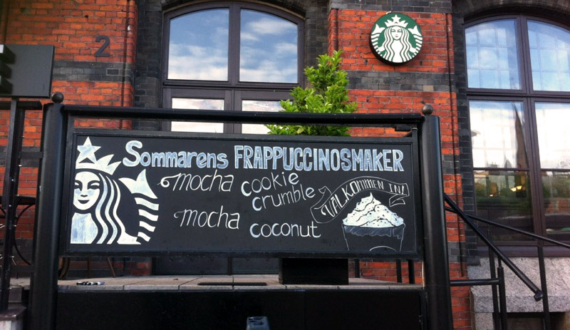
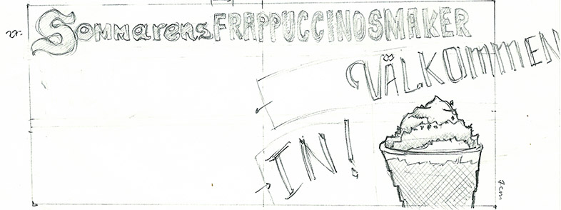
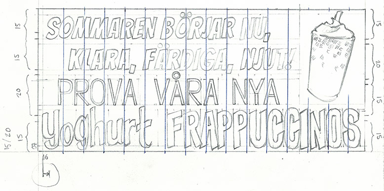 2015 May campaign: This also starts with an OFL font being used. One of the more text-heavy boards I encountered. I did establish some consistent measurements and guides for future boards from this run.
 2015 July campaign: This was semi-rushed and came in slightly short notice. I was content with the overall effect, though some of that unpreparedness shows in the chaotic, unmeasured writing of the flavors here.
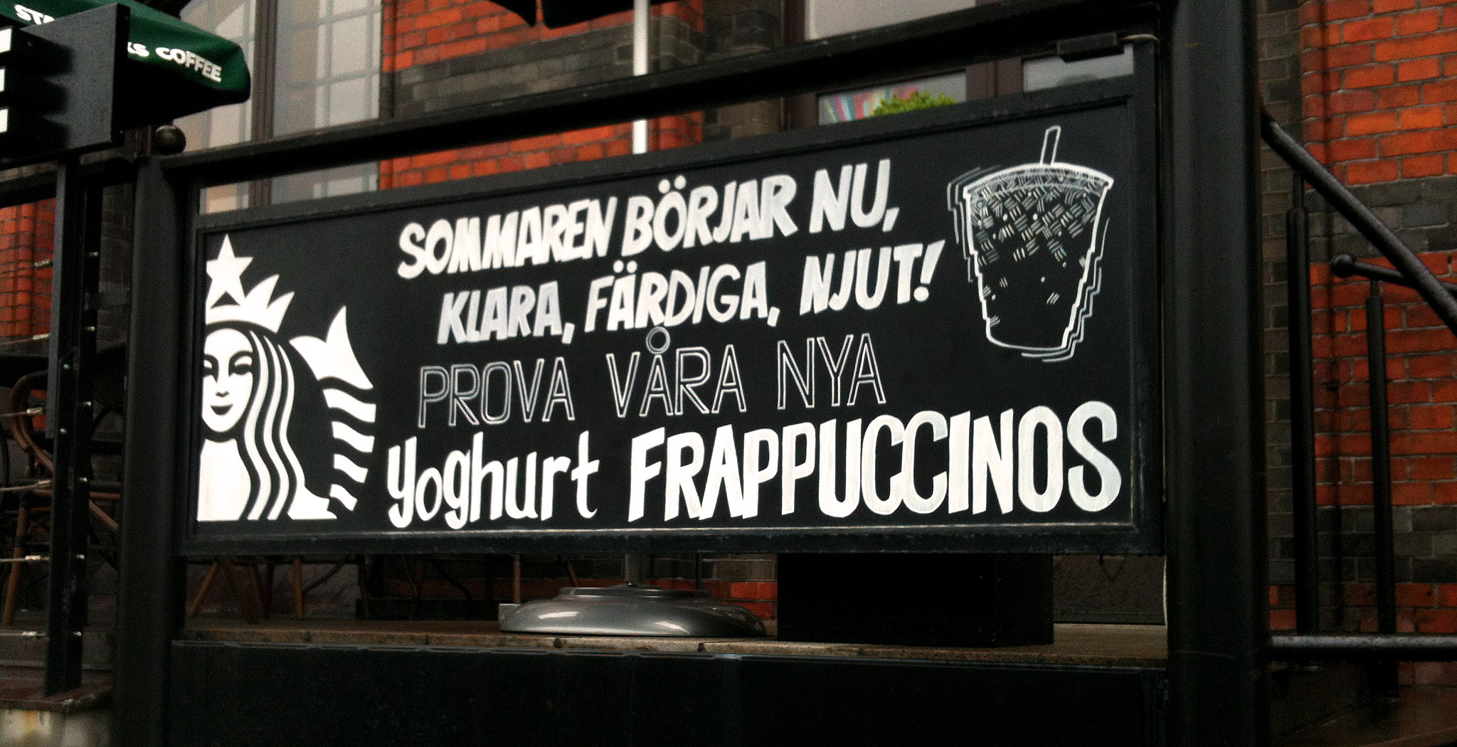
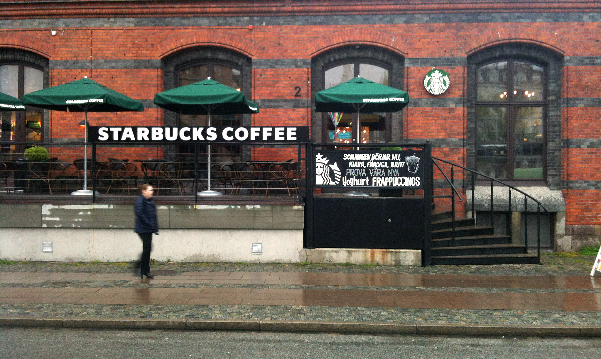
 2015 September campaign: This one was surprisingly easy to execute. A lot of the work was in the measurements of the lettering to make it all fit properly.
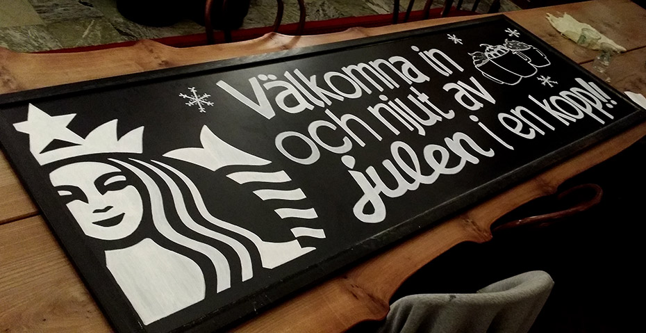
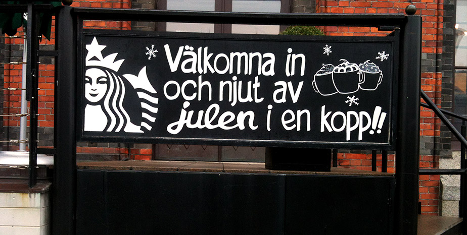
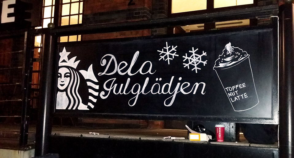
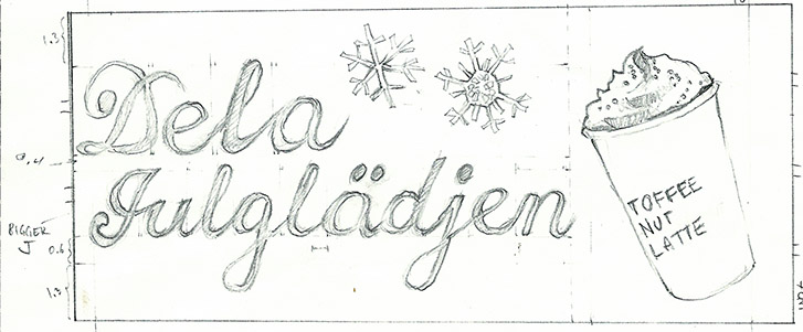
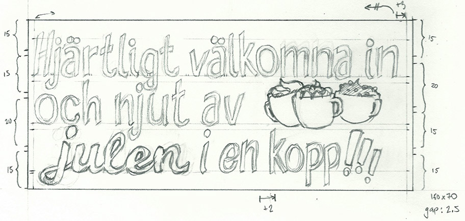 2015 November campaign: As part of the usual holiday campaign I used my own version of handwritten lettering to pull off a more personal touch.
 2016 January campaign: This was an exercise in using all the usual letterings together in a way that still feels fresh to look at. Went pretty smoothly.
 2016 March campaign: With this campaign I wanted to use the lettering to divide the two drinks. It allowed both a separation of them both and something a little more centered and new for us.
 2016 May campaign: Following the last campaign, this was another attempt of the same but this time having the flavors side-by-side as well. It looked great, though the top and bottom lines involved a lot of fill.
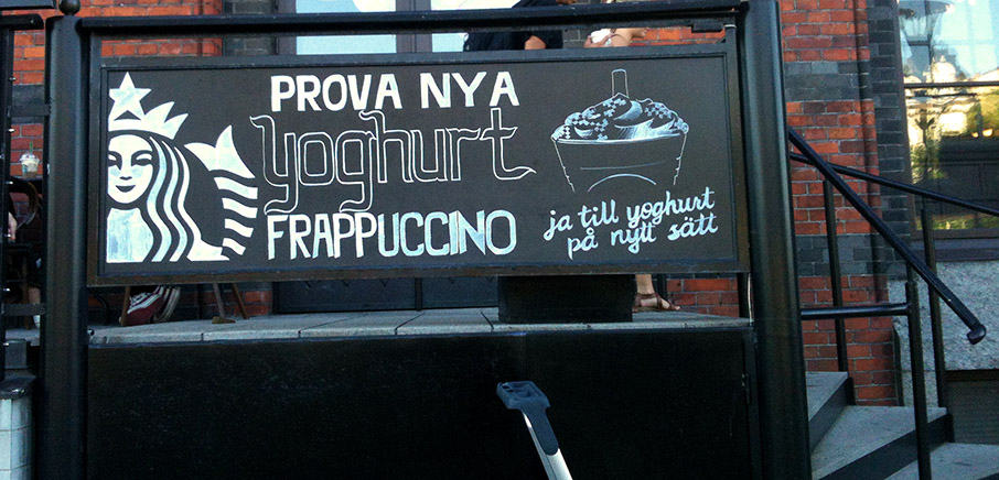
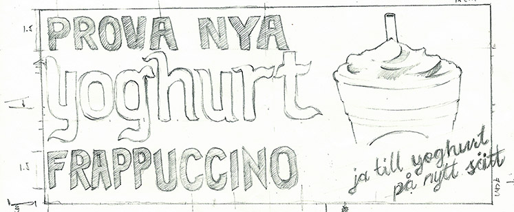
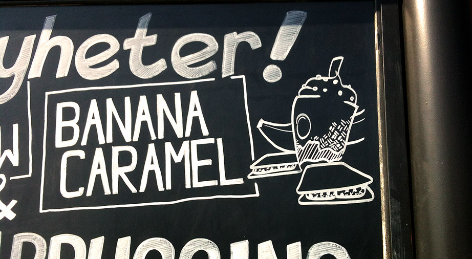
 2016 July campaign: This one was great in that the graphic included the flavors and took up a lot more of the sign space. Having the graphic this large with some playful lettering was a nice change.
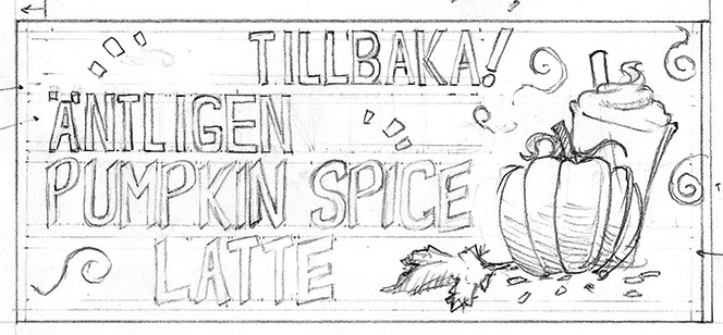
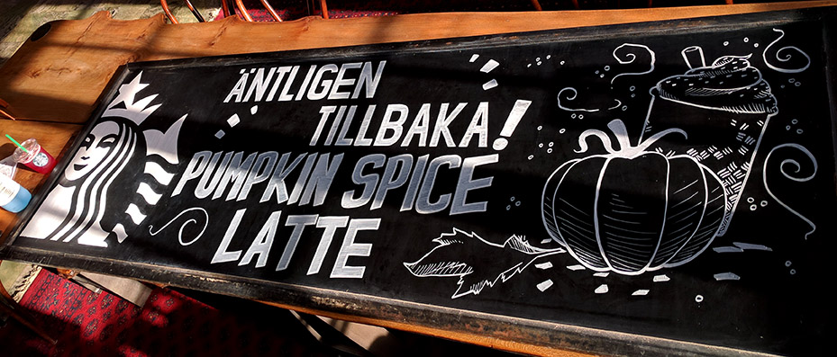
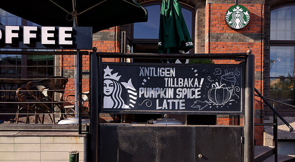 2016 September campaign: Following the last campaign we have another large graphic paired with lettering that's playfully placed instead. Use of the swirls helped make the board look busy with excitement.
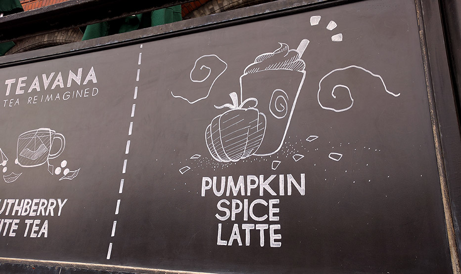
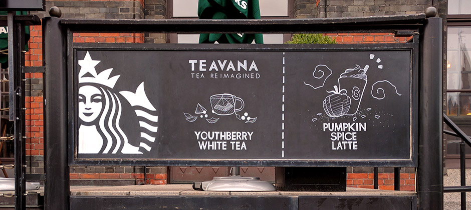
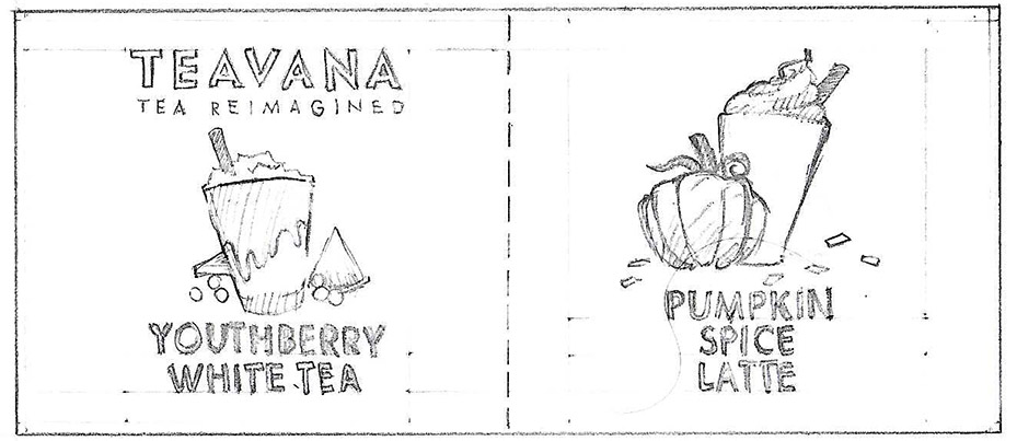
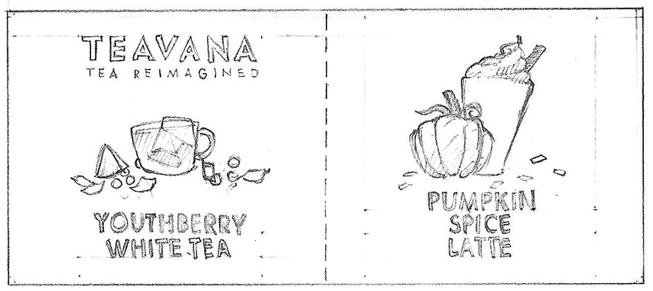 2016 October campaign: Here is one of the only times the board was divided into to areas with a drink in each. While the use of whitespace was welcoming, the actual legibility of the sign was limited to the sidewalk. The text was still kinda legible from further away though.
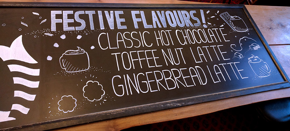
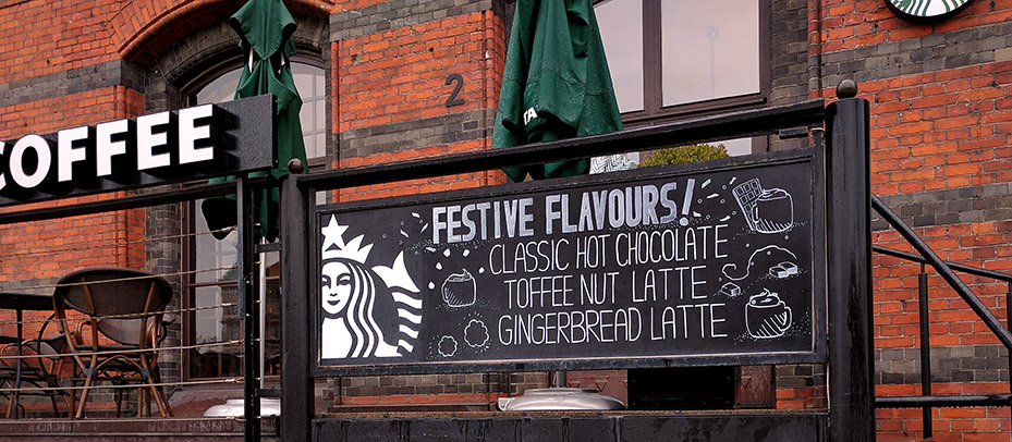
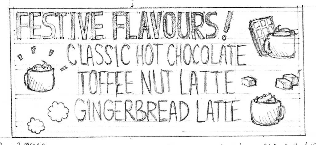 2016 November campaign: The last holiday campaign had three flavors. In a way this was designed mostly so people see the top line most. The flavors one can see and choose from when closer to the sign.
 2017: Starbucks left from Malmö at this point. It's well missed.
